Craig Charley
24 May 2013
Pixel Perfect: Social Media Cover Photo Dimensions & Photoshop Templates
Pixel Perfect: Social Media Cover Photo Dimensions & Photoshop Templates
Your profile and cover photos on social media are an essential consideration when setting up your page but they're often one of the most neglected areas for trainees on our social media courses. They tend to be the first thing any visitor looks at and therefore are your chance to make a great first impression.
Getting the right image for each position and platform can be tough - there's no consistent size or rules that apply - which is why we decided to put together this handy guide to help you get the best images for each of your pages on Facebook, Twitter, Google+, LinkedIn and YouTube

There are two options for you to choose from, depending on your experience and understanding.
If you're a dab hand at Photoshop, we've created a set of social media cover photo templates for you to use. You can download all of them here and to use them, just follow the instructions below. We've also added graphics showing the dimensions for each so you can resize your images without using our templates.
Struggling with images for the web? Photoshop is an essential tool for web marketing and our Photoshop courses are perfect for getting to grips with resizing, cropping and saving images for the web.
Photoshop Templates
Using our Photoshop templates is simple. All you need to do is:
1/ Paste your chosen image onto the layer ‘PASTE IMAGE HERE’.
2/ If present, click the ‘eye’ icon to hide the layer ‘HIDE BEFORE SAVING’.

4/ Click save, on the save box choose ‘Selected slices’ in the Slices options.

5/ Your cover photo will be saved in a folder called ‘images’ in your chosen location.
And it's as easy as that!
Unless you stick to the given dimensions, the size of your cover photo on Facebook will adjust depending on the device it's being viewed on.
This is worth considering because if you upload an image bigger than the dimensions given below, it will show the entire photo on the mobile app - even if it's portrait.

Download the Facebook Cover Photo Template
With the Twitter cover photo, you won't have the same issue as on Facebook (it does changes slightly on the mobile app, but we're talking a matter of a few pixels).
One thing to remember, you'll want your bio to be seen and so think about what will appear directly behind that. Twitter uses white text with a shadow for your name and bio which works well on most images, but not particularly busy ones so try to keep it plain.
On Twitter you can also choose the background for your profile. Due to the huge range of screen sizes available we recommend sticking to a pattern so that it appears the same on all devices.

Download the Twitter Cover Photo Template
Google+
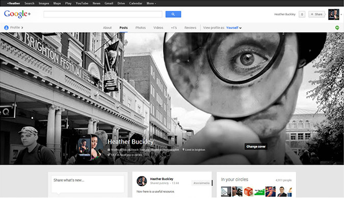
Google+ is probably the hardest of the bunch to cater for across all platforms because it doesn't seem to have any set rules. Not only is it different on a mobile, it's different again on the mobile app and on tablets and even seems to be changing quite regularly on desktop.
Our best suggestion though is to go with the dimensions below.
Don't forget on desktop, it will only show the bottom inch or so at first until you scroll up, so think about what appears at the bottom of the image too. We've seen plenty of cover photos with groups of people, where Google+ only shows their feet most of the time!

Download our Google+ Cover Photo Template
LinkedIn is easier than most. The dimensions below will fit desktops and on the mobile version it won't appear at all, so you needn't worry about it. This only applies to business pages and not personal profiles.

Download our LinkedIn Cover Photo Template
YouTube
YouTube has a similar problem to Google + (considering it's part of the same organisation, it's not that surprising).
It will cut off the edges of your photo on the mobile app, so bear that in mind, but if you use the dimensions below and choose an image with the majority of focus on the centre, you should be all right. Your photo is also cropped depending on your browser size on desktop.

Download our YouTube Cover Photo Template
If you've found our templates useful, please make sure you share them around - and make sure you send us your finished cover photos.
