Enquiry Now

 Contact Us


 Check Out
 +44 20 4571 2395

 PRINCE2® Foundation and Practitioner Training


 Aaron Charlie
 29 Apr 2013
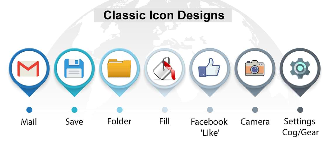
Classic Icon Designs - Time for a Change?
Skeuomorphism is, according to Wikipedia, "a physical ornament or design on an object made to resemble another material or technique." It's a somewhat controversial design technique that has been around for centuries.
In terms of web and mobile design, skeuomorphism is most commonly referred to in terms of icons or even apps and software which use representational design elements that possess little or no functionality. You can learn all about skeuomorphism on our InDesign Training.
An example of it would be the notepad on Apple iOS devices which has been designed to look like a traditional paper notepad. There's no need for it to be designed like this, from a functionality perspective, but the way it looks makes its purpose easily identifiable. The skeuomorphic philosophy employed by Apple is a big part of their approach to making tech simple and ultra-user-friendly.
It's not just Apple that uses this technique though; it has been in use in the tech industry for years, especially with regard to buttons and icons.
But is it a good thing? Should we really be using symbols that don't mean anything in terms of the app or software?
I'm going to take a look at some of the most prominent examples of skeuomorph buttons and icons, ask whether they really possess any relevance to their actual function and if not, what could they be replaced with?
Connor Tomas O'Brien argues in this post that such design is necessary and still worth keeping and while I agree with much of what he's saying, I take a slightly different view to him.
First up:
The mail icon is an envelope, which in terms of traditional 'snail' mail makes sense but has got nothing to do with email.
Used for almost every email service there is, the 'mail' icon is the epitome of a design which bears no actual relation to its function.
So could it be replaced? Perhaps, an alternative could be an @ symbol (intrinsically linked with emailing and actually part of the function) or perhaps it doesn't need any visual representation at all. We all know what email is now, why not just replace it with the logo of the email provider, the word 'email' or whatever else.
Save
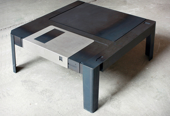
The Save icon will be one which will, if it continues to stay the same, completely confuse future generations. The icon dates back to the time when saving on a floppy disk was the norm, hence the floppy disk symbol.
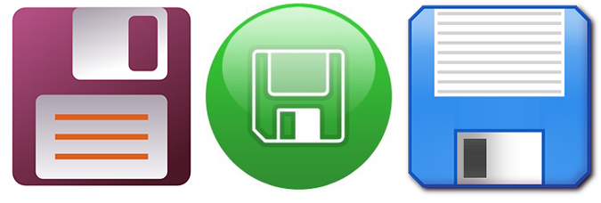
It has absolutely no relevance today, with most things saved on a hard drive or flash drive, or even in the cloud.
The problem with replacing the icon though, is that to replace it with a symbol that better reflects the current function associated with saving, would be to run the risk that it becomes very quickly outdated.
Interestingly enough, cloud-based services like Google Drive don't actually use a manual save function at all, it's automatically updated; a trend which is likely to become bigger in the future. Does that mean the save icon will become functionally obsolete too?
The main thing though, is that these days, most acts of saving require pressing a button with the word 'save'. That simple piece of (non)design seems to make most sense and is the easiest understood by the user. Minimalist styles like this have become an important trend in design; take a look at these minimalist movie posters for example.
Folder
This is a bit more difficult and perhaps a controversial inclusion because the actual function is called 'folder' but it makes the cut because physical folders (as per the icon) have nothing to do with computer folders.
It's also tough to come up with an alternative so this may be a case where it's not just the icon, but the entire concept that would need a re-brand. Is the word folder accurate enough to describe what is essentially a limitless (in potential not size) multimedia storage system.
You wouldn't have stored videos, books or songs in a physical folder, but that's exactly what virtual ones do.
So a new approach, like Google's 'Drive' or like Dropbox, may be the way forward for the folder name and icon.
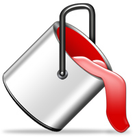
Fill
I've always struggled with the link between an overflowing paint pot and the fill function(it's more like spill).
I think that a visual representation of the actual function would be better i.e. a box/block of colour that can be toggled (a la swatches in Adobe programs).
Again, this is another symbol that will lose all meaning in the next 10 years or so.
Facebook 'Like' Thumbs-up
This could be considered an odd one; compared with the other icons in this list Facebook's thumbs up, representation of 'liking' something, is very new. The thing is, it already feels a bit out of date. Giving a short nod of approval occurs on so many sites across the web in so many different forms, that Facebook's thumbs up that used to be quite original, now feels like just any other.
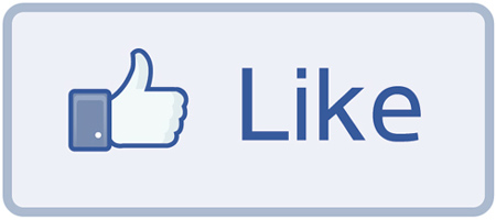
I think a numerical representation like on G+ or many of the Facebook Like buttons on sites across the web, is a better way to go - it quantifies the action better. You can find out why installing social media buttons on your site is a good idea on our 2-day Social Media Course.
Camera
Now I'll make a distinction here, the camera icon I'm talking about is the one which represents an 'old-school' camera, like the one below, yet is used on smartphones that look nothing like them.
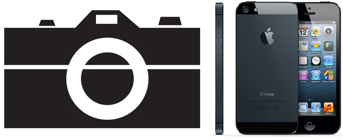

The more general 'lens' icon is fine, it mirrors what is on most smartphones. Apple actually use both kinds on their devices -
So thesecond kind yes; continue to use that. The first kind, no more!
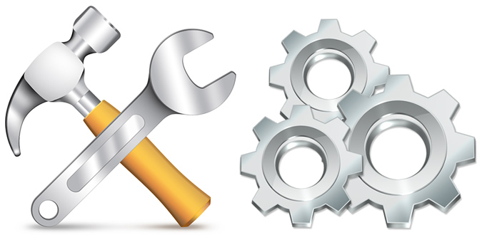
Settings Cog/Gear
Another symbol that seems to have a very tenuous link to the actual function. It's used everywhere though, from Facebook to iPhones. The next most common symbol, a hammer/spanner and screwdriver/pencil, at least makes a bit more sense metaphorically but it's still not exactly representative of the function enacted on computers/phones.
What's the alternative? Something that better represents the instantaneous changes that can now be made in most 'settings'. Deciding what that thing is would, I think, require a collective deliberative effort but I quite like the idea of something related to sliders because that tends to be a key feature of most settings applications.
Posted under:
 Need Any Help?
Recent Blogs