Aaron Charlie
3 Jun 2014
Quick Guide to the New Facebook Business Pages
Facebook has rolled out the new page design for the majority of business pages.

If you haven't already updated, then your page is currently in what I like to call 'limbo'.
The new design is visible to page admins, but not to fans or anyone else dropping by your page until you click the 'Update' button.
The update button is found on the new fixed admin frame to the right of 'Settings'.
If you're managing your page and still seeing the old layout then don't worry, there is a chance that all pages are getting the upgrade by June 6th.
Don't be confused when you update, read through my tips and find out what you need to know about the new Facebook Business Pages.
Find out how to get more out of your social media presence, including Facebook, with our two day Social Media course and see results within weeks.
New Layout
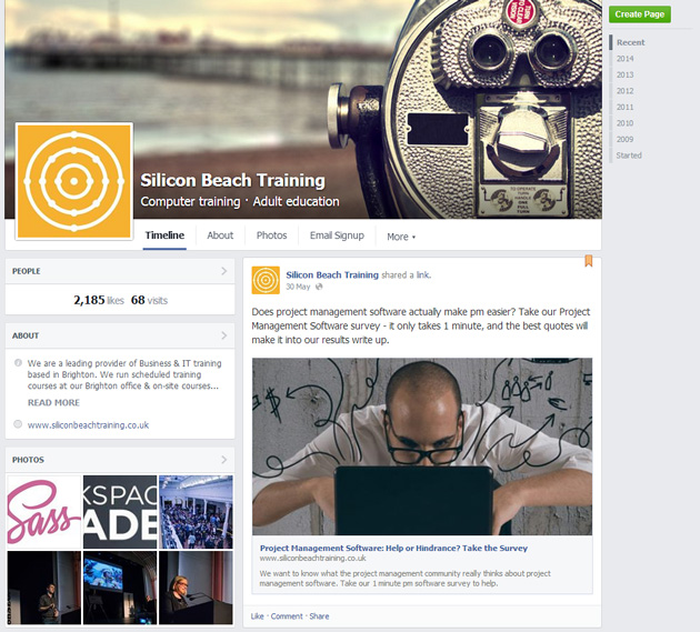
Here is the new business page layout for visitors:
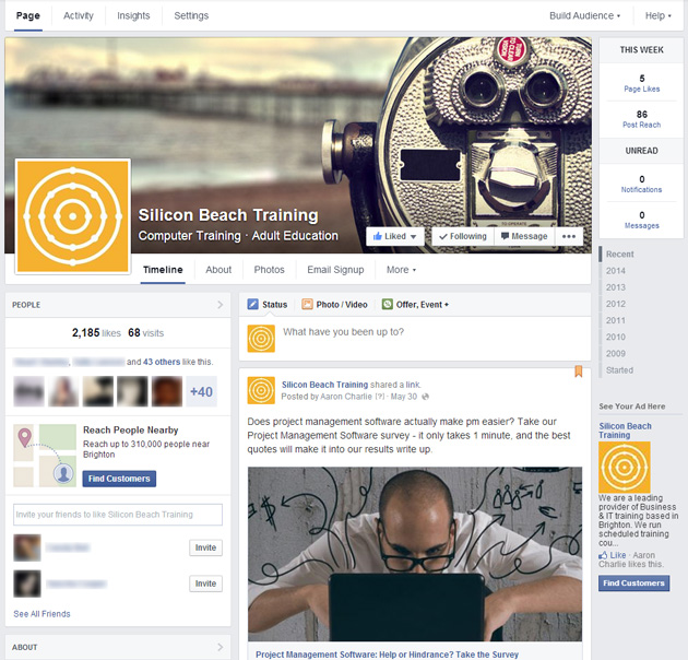
And for page admins:
The biggest change to the layout is the switch to a one-column timeline, with the page information in a thinner column on the left of the page.
I personally like this change as it puts the information in a more logical order. It is easier for visitors to read through your stream and also to get to important information about the page.
The profile picture and cover photo remain the same size but are aligned differently, so any clever timeline/profile picture tricks you have will need to be reworked (remember that these won't work on mobile anyway!)
More importance is given to your most recent (or pinned) post, which will be the only update visible when visitors first land on the page due to its size and placement.
The larger timeline means that embeddable content looks great - photos, videos and even links if you get the thumbnail right. As Matt Owen writes for Econsultancy,this shows a determination to focus on content.
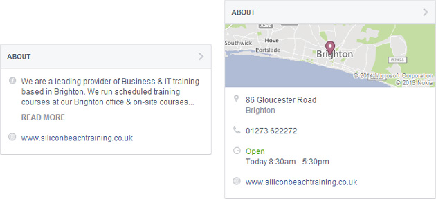
The information shown in 'About' differs depending on the type of business page.
Local businesses will show location, hours, phone number and a map - which I think is a bit unfair as other types of page only show a couple of lines of description and a website link. It would be nice to have contact details visible for all types of pages.
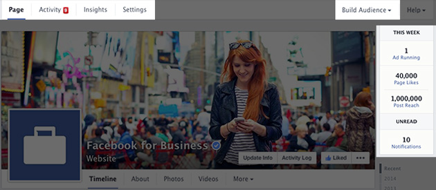
The admin panel has changed quite dramatically and now operates as a fixed frame around your page.
There's a snap shot on the right showing new likes, post reach as well as unread notifications and messages.
Thankfully the insights have remained the same as most people will now be familiar with the latest update.
Notifications and Messages now sit under the same tab 'Activity' which has a much cleaner feel than before.
Messages open in a pop-up window that allows you to focus on the conversation at hand.
Hidden Tabs
The change that will anger most people is that tabs have been hidden even more than the last update.
Custom tabs is an ongoing fight for Facebook. In the past they allowed page owners to heavily customise their Facebook presence with tailored landing pages and the ability to drive visitors towards a specific action (towards a competition for example).
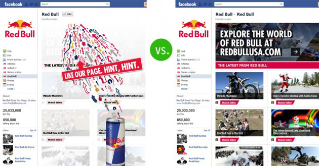
Many people spent considerable amounts of money on custom Facebook landing pages and were furious when this option was removed with the last major page update.
At least after that update, you were able to create custom tab images that drew visitors to perform specific actions.
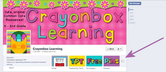
Now, you're left with text tabs and there is only room for two tabs at the top of the page (alongside about and photos) so you need to think carefully about the most important actions for visitors.
In terms of driving visitors towards a tab, you might be able to do something creative with your cover photo now that Facebook has relaxed its rules on text and CTAs.
Pages to Watch
This is a great newish feature - but it was actually better on the old admin layout!
Pre-update you could see your watched pages as soon as you landed on your page.
Now you have to click Insights and scroll to the bottom of the page.
Pages to Watch allows you to keep track of your competitors and make sure you're beating them.
Keep an eye on new page likes & engagement - are they doing something well that you can replicate?
Who Posted That Status?
Another update that was rolled out early is the ability to see which page admin posted a page update.
This is only visible to page admins and gives accountability to people responsible for managing an account.
You can look out for repeat spelling offenders and it should also lessen the chances of sabotage from a disgruntled employee.
Emphasis on Ads
Facebook has always been happy to push paid activity, but this latest update takes it to a new level.
When logging into our page I can see 6 separate calls to give Facebook money.
Every individual status has a prominent'Boost Post' button.
Even when writing a new update the 'Boost Post' button is bigger than the 'Post' button!
The insights platform also gives equal prominence to paid and organic activity.
We are now at a point where businesses are going to have to start paying if they want to retain a presence on Facebook.
Some legacy pages may have built up such a committed following that they've retained their organic views, but for most (including any new pages), organic views are likely to be less than 10% of followers.
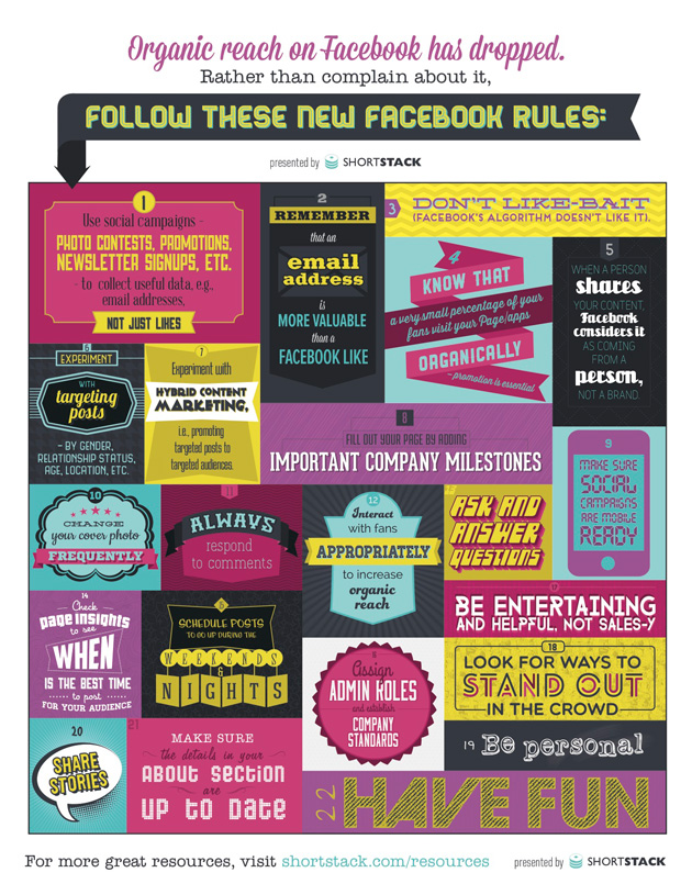
Need some ideas for increasing organic reach? Try this infographic from ShortStack.
