Brand new course! No coding experience? We'll teach you all you need to know to make iPhone apps on our iOS App Training for Non Developers course!
JavaScript has been frustrating developers for years, but with javaScript libraries and frameworks like jQuery JavaScript is regaining its street cred. jQuery is not of course the only javaScript framework around, but the main reason that JavaScript is becoming more interesting and exciting is the ever increasing development of JavaScript libraries and frameworks.
If you're into your JavaScript Libraries, check out our Top 6 jQuery Tutorials
The real problem with JavaScript (released in 1995) lay with what we now call the DOM (document object model). Browsers implemented what we now know as the DOM in different ways meaning that browser cross compatibility was a nightmare. The standardisation of the DOM made thing a little easier but Internet Explorer (the bane of many a developers life) did not support basics like addEventListener until 2010 in IE9.
JavaScript frameworks provided developers with solutions to more easily overcome many browser bugs, allowing developers more time to develop.
Heather Buckley
2 Feb 2011
Silicon Beach offers a range of Programming Training courses. We also offer Social Media Training, Ajax Training, Photoshop courses, PRINCE2 Training and Web Design Training in Brighton, Sussex. Bespoke courses are also available.
A robot that can detect faces and emotions!
Went to a breakfast meeting today called "Likemind" in Brighton and met some interesting people. Ian Oszvald a self-confessed Entrepreneurial Geek popped this little gismo out of his bag, brilliant! It is called the Headroid1 and is a face-tracking robot that can follow people’s faces, it is being developed to detect emotions and react to engage with people, I believe Ian is working on the "Smile Detector".

He says that programming is getting easier and is using a programming language called Python. Python is a programming language that lets you work more quickly and integrate your systems more effectively. It's supposed to be easy to read, quick to write, runs on all popular platforms and is open source (which means it's free) "Anyone can make stuff like this now." he says (yeah right I'll just knock one up - give me a minute!).
As you can see from his demo the camera is tracking me as I move shifting and tilting so that my face is always in centre of the screen.
It's a collaborative project by BuildBrighton. Ian developed the AI for the device. If you want to learn more about the programming and code side of things you can read up about it on his blog.
Heather Buckley
21 May 2010
Custom Facebook Tab Using iFrame App
FBML is Dead - Long Live the Facebook iFrame App!
Lots of businesses use Facebook Fan pages to promote their products and services. In addition to the standard page tabs (Wall, Photos, Links, Videos etc...) Facebook had its own markup language called FBML that allowed you to easily create your own custom tabs. This was really handy for creating custom landing pages and special pages for promotions.
On 10 March 2011 Facebook withdrew FBML (the spoilsports!), so you can no longer add FBML custom tabs to your Facebook Fan page (if you already have an FBML page it will continue to work though - phew!).
HOWEVER - there's a new way to create custom tabs for Facebook pages - enter Facebook iFrame Apps! With an iFrame App, you can create normal web-pages using good old fashioned HTML & CSS, and embed them in new tabs on your Facebook Fan Page - sweet!
To use iFrame Apps you'll need to know some HTML and CSS, and also be able to upload content to an FTP server (which if you have your a website shouldn't be a problem!).
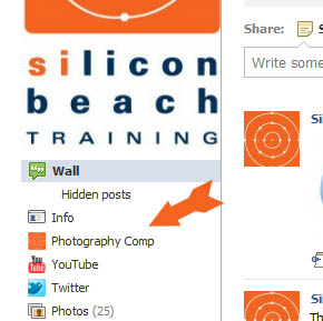
But let's not get ahead of ourselves! In this tutorial we're going to cover how to use FacebookiFrame Apps to create simple HTML page tabs in Facebook Fan Pages
If you have a Facebook Fan Page - find out how to optimize it for SEO here
How to create a custom tab in Fan pages with Facebook iFrame Apps
|
Before you start - you will need:
OK - if you have all of the above, we're ready to go. In this tutorial, I'm going to show you how I re-created this with a custom iFrame tab... |

Aaron Charlie
11 Mar 2011
|
There are many different ways to draw maps - including photographic techniques and of course old fashioned hand drawing. However if have some Adobe Illustrator skills, using its vector drawing tools is a great option, as it means your maps will be fully scalable - you could blow it up to A0 size without losing any quality. Within Illustrator there are many If you would like to learn more about Illustrator, then come along to our Illustrator Training course in |

Brighton, Sussex. If you already know Illustrator quite well, you may want to have your own private Advanced Illustrator Training. We also run regular Photoshop Training and InDesign Training courses.
An Illustrator map will provide artwork which is razor sharp, scalable, supporting industry standard colours such as Pantone for print and HTML for web.
Illustrator Tutorial: Drawing a Scalable Map in Illustrator CS5
Output Formats
The final format you should export your document in is .EPS for print or GIF for the web. To insert the map into PowerPoint, you might export the map as a JPG at high to maximum quality.
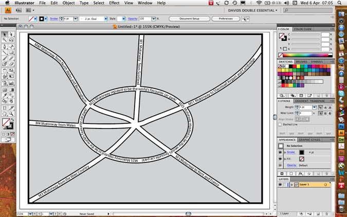
Here is an example of our finished map
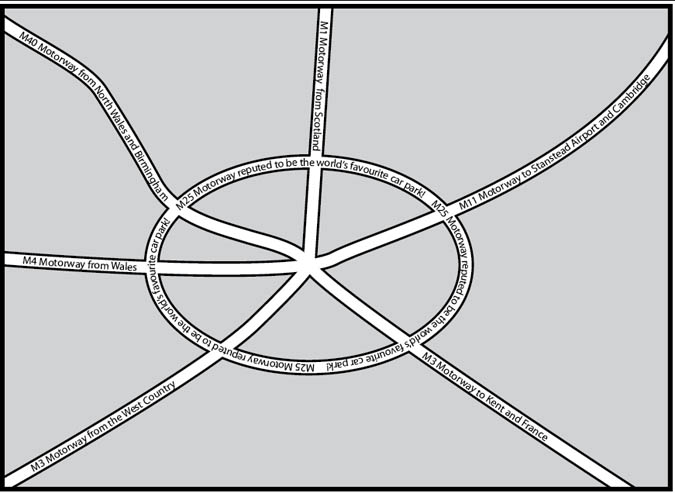
As you can see it does not pretend to have any cartographic or scale accuracy but it is very clear to read and can be simplified to clearly show the way to an office or point of interest, etc.
Tracing over a scan
If one wanted to preserve the accuracy of a previously drawn map, one would need to open a photographic version of another map (a screen grab or a scan), define the layer as a template layer, create a new layer for the new artwork and draw over the scan, keeping the curvature of the roads perfectly accurate. This will be the subject of a further lesson.
N.B. Scanning a map requires permission from the copyright holder.
--READ MORE--
Start a new document
File menu / new or (CTRL+N/ CMD+N)
A5, landscape, no bleed, print or web profile as required by you.
The Roads and Roundabout
Illustrator draws lines in a number of ways: the line tool, the pencil tool and the pen tool.
Use the line tool for separate straight lines
Use the pencil tool for freehand and often wobbly lines
Use the pen tool to give continuous lines of accurate corners (a click), or lines of a precise curvature using industry standard vectors (click drag).
Colours in Illustrator are applied to the Fill (the inside colour of the object) or the stroke (the line going around the edge of the object).
The roads in this map will have a stroke of either black or white, but a fill value of none - the “no entry” colour in the toolbar, the swatches or colour palettes.
It is best to draw the roads with a stroke of one point black.
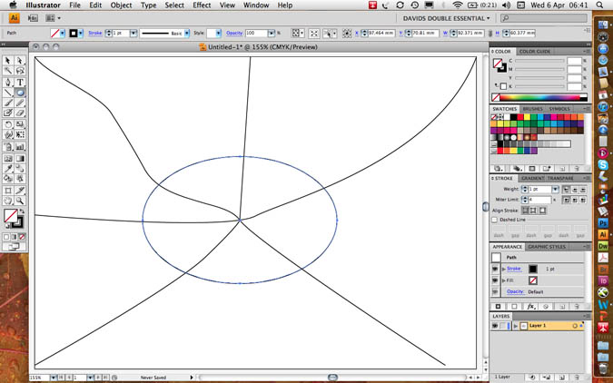
Draw four or five roads, which intersect at the centre of the map.
Make them extend further than the finished frame of the map.
Notice that when you use the pen tool, a click creates a corner point whereas a drag creates a curvature: drag down for an upward curve and vice versa.
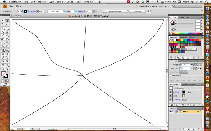
Make a roundabout using the ellipse tool - no 3 in the shape tools. Using the alt key will originate the road from its centre, not from its first clicking point.
Your artwork should look something like this…
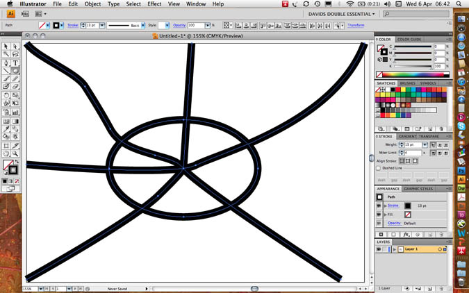
Increase the stroke weight to 13 points and make sure your artwork has a fill value of transparent so that the curves in the roads do not fill in with an opaque solid colour.
Group all the roads (select all CTRL+A / CMD+A then group CTRL+G / CMD+G)
Copy (CTRL+C / CMD+C)
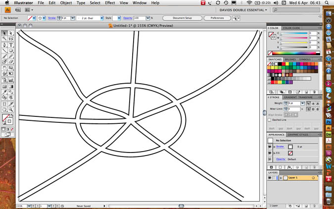
Do not paste (CTRL+V / CMD+V) as this will put a duplicate in the middle of the page; paste in front (CTRL+F / CMD+F) which will make a duplicate exactly in front of the previously copied artwork.
Set the stroke of the new roads down to 9 points and colour them white. This will give you 2 point pavements which neatly interconnect with each other!
Text on a Path
Paste in front (CTRL+F / CMD+F) one more time to provide a grid of black roads. When you click on a line with the third Text Tool (text on a path) the fill and stroke values of the roads will disappear and the type will take on the same direction as the roads, however curved or cornered.
Open the Type Character palette (CTRL+T / CMD+T) from the Type menu or the Window/ Type and tables menu.
Set the type size small enough to sit within the road and use baseline shift (bottom left in the character palette to a negative value so that the text sits in the middle of the road and not on top of it. I used a 9 point line with a minus three point baseline shift in the following example.
The first accurate setting of type characteristics will set a precedent for all of the other roads.
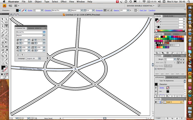
If you want text to go in two different directions on the same path at the same time you will have great difficulty. It is correct to duplicate the line itself; use one line for upward text (e.g. my M4/M11) and a separate line for downward text (my M1)
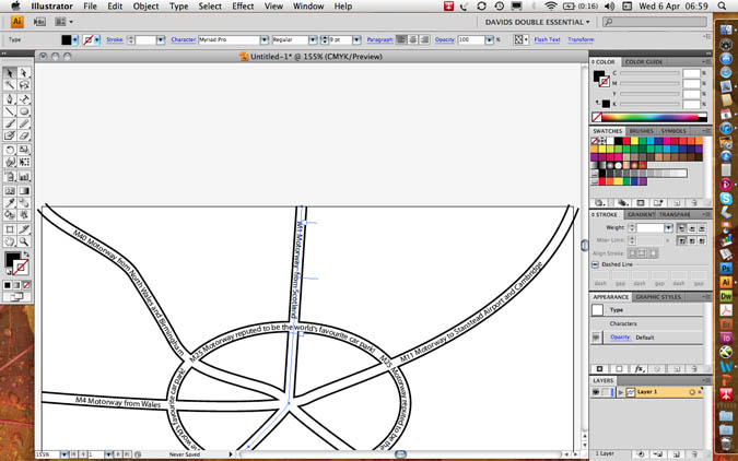
You will find three text I-beams: the start, the centre and the end point. By dragging the centre point around the end of a line, you can invert its direction.
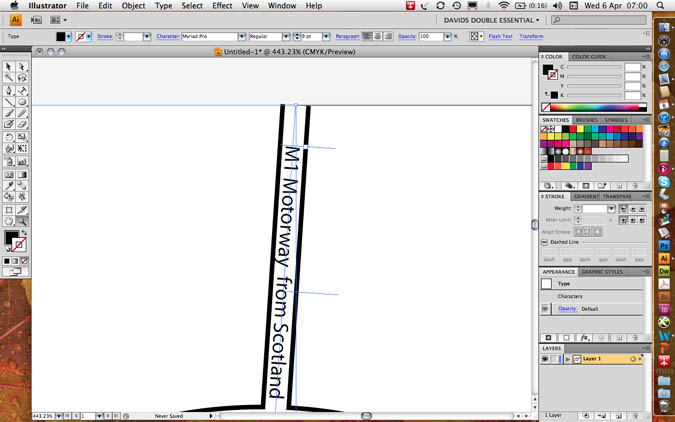
Masking and the Frame of the Map
Masking
Group all the roads and the text: Select all CTRL+A / CMD+A then group CTRL+G / CMD+G.
Make a rectangle with the rectangular shape tool which is exactly the same size as the finished map. Please ensure that road ends protrude off each edge.
Give the box a fill value of 20% black and a stroke value of 4 points black.
Copy the box to the clipboard: CTRL+C / CMD+C
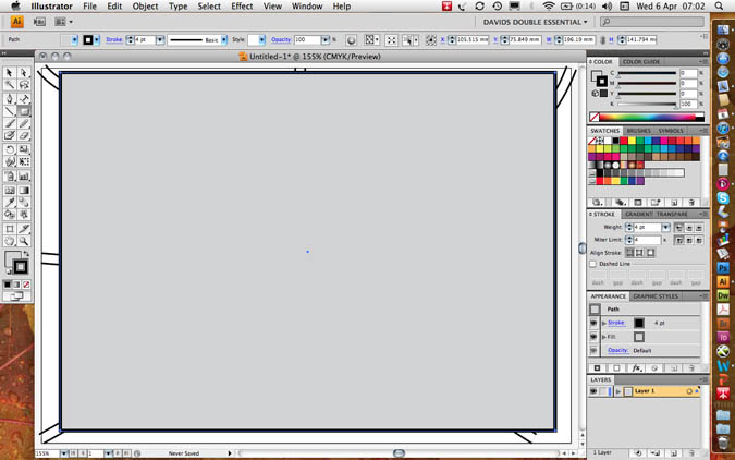
Select both the roads and the box.
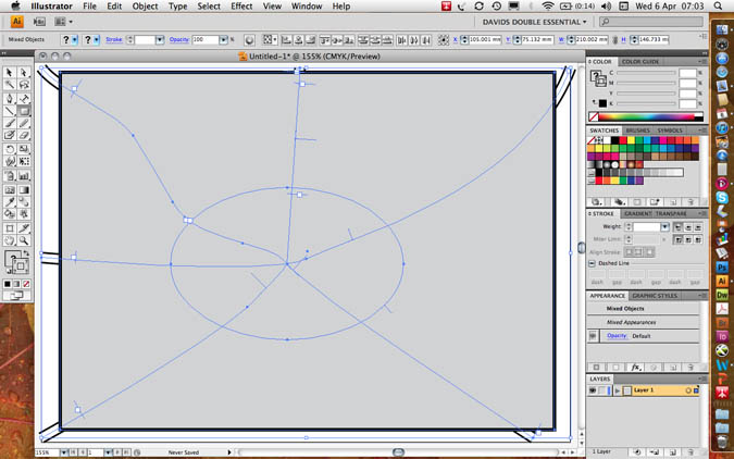
Go to object menu/ clipping mask/ make to include the map and exclude the overlap. This is what is meant by a “clipping” mask – like scissors.
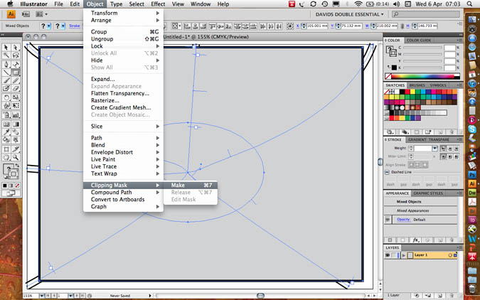
You will notice that the box no longer has any stroke or fill value rather similar to text on a path.
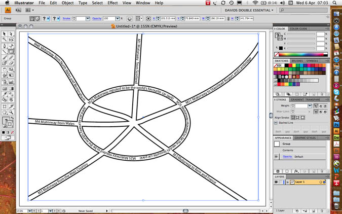
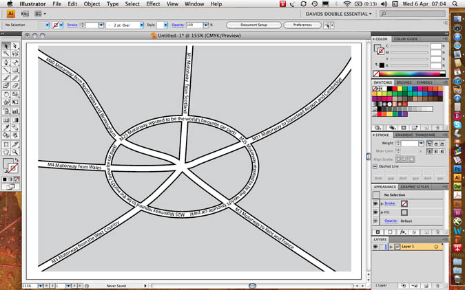
Now paste a copy of the box behind the map with edit menu/ paste behind CTRL+B / CMD+B.
Set the stroke value to 0 points but keep the fill at 20% black.
Next paste a further copy of the box in front CTRL+F / CMD+F and set the fill value to transparent but keep the stroke value at 4 points black to make a neat frame as in the following example.
File Formats for Export
The .EPS Encapsulated Postscript is the most used file format for the printing industry.
It is best practice to keep the version as the latest version with an 8 bit preview for on-screen visibility.
File Formats
Most printing programs accept Illustrator’s .EPS file format, encapsulated Postscript. This format supports background transparency and is infinitely scalable to any size up or down.
I tis never pixelated as the file format is composed of mathematical vectors, lines and curves, and not pixels as found in photographs.
To output files for PowerPoint the bitmap .JPEG format is often preferred. You cannot save as to a photographic file format, but instead should go file menu/ export to JPEG, choosing high to maximum quality.
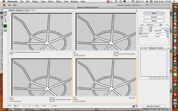
To output files for Web use, go to: file menu/ export for web and devices.
Here you could chose .PNG for web transparency, .GIF for logos or .JPEG.
You can choose optimisation values by choosing a 4-up preview.
Aaron Charlie
5 May 2011
The Brighton Photo Fringe is nearly upon us, there are going to be so many things to do and see I'm getting quite exited. By the way if you are a photographer yourself you might want to head over to our Photography Competition as there are some great prizes on offer or if you need to brush up on Photoshop we offer beginners and advanced Photoshop Training in Brighton, Sussex. For those needing to learn how to market themselves we also provide great Social Media Courses and Search Engine Optimisation Training Courses. Anyway back to the Photo Fringe.
One Exhibition in particular I'm not going to miss is Heather Shuker's "Girls UnScene". Heather is a talented Photographer who recently had the misfortune to have her venue pulled at the last minute so she has had to relocate. So to see Heathers controversial and unique insight into Brighton nightlife you will need to get yourself to Add the Colour, 64–65 North Road, Brighton BN1 1YD - between 1 Oct to 8 Oct 2010. After this the exhibition will be moving to the The Street Cafe & Gallery, 101 St James Street, Brighton BN2 1TP...

Heather Shuker - Girls UnScene
Incidentally Add the Colour is a great place to get to know as a photographer - I'm often there! You should check them out as not only is it frequently full of photographers drinking coffee but Dan also hosts photography talks and workshops on a regular basis.
The Girls UnScene - Photography by Heather Shuker
The project was shot over a 2 month period in clubs and bars in London and Brighton in 2009 - mainly Brighton - including Digital, Coalition, Audion, Globe, and West street.
Heather Buckley
29 Sep 2010
Find wifi cafe in Brighton - image by www.heatherbuckley.co.uk
The MetOffice warn us of another 5 days of snow and below freezing temperatures. The Brighton bus services are as precarious as the pavements, and you are the only one that actually made it into the office. Time to make the same excuse as everyone else, it's a “snow day”!
But don't hide at home. Instead, head to your nearest cosy café or pub with wifi and work from there. No excuse not to be online, Social Media is definitely not having a snow day. We provide SEO Training, Email Marketing Training, Google Anlaytics Training and Photoshop Training, in Brighton, Sussex - just some of the skills you could learn to keep you busy when you can't get out.

Here is a list of my favourite free wifi across the centre of Brighton, from Kemp Town to Hove. They all have a great laid back atmosphere that might make you want to stay for longer than planned.
Add The Colour
Bright, open, spacious, very comfortable and flexible, great place for photographers and office meetings. Wonderful coffee and delectable cakes 64-65 North Road, BN1 1YD
Find it here
Kemp Town Bookshop
Independent little gem of a bookshop with a cosy and quiet café on the top floor. Hot drinks, grilled sandwiches and a range of cakes will keep you feeling warm throughout the day.
91 St. George's Road, Kemp Town, BN2 1EE.
Find it here
Aaron Charlie
1 Dec 2010
Here in the heart of Brighton's North Laine you're spoiled for choice when it comes to places to eat.To make it easier for you, here's 10 of our favourite places to eat (in no particular order) - all within a short walk of our training centre in Gloucester Road.
UPDATE Jan 2010: This is now our top 12 places to eat!! There are SO MANY to choose from we had to add two more. Thanks especially to Brighton foodie Greg Dreyfus for his recommendations.Try them out - or if you've got your own favourite which we haven't listed, leave a comment and we'll check it out!
Price key:
£ - Under a fiver
££ - £5-£10
£££ - Over a tenner
Andy Trainer
24 Sep 2009