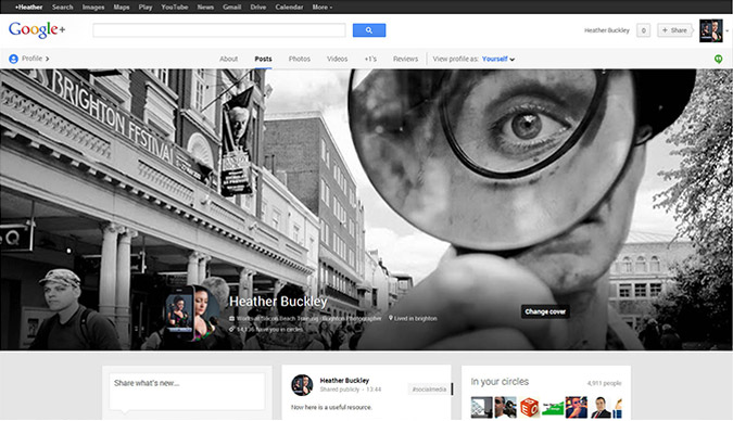
Your profile and cover photos on social media are an essential consideration when setting up your page but they're often one of the most neglected areas for trainees on our social media courses. They tend to be the first thing any visitor looks at and therefore are your chance to make a great first impression.
Getting the right image for each position and platform can be tough - there's no consistent size or rules that apply - which is why we decided to put together this handy guide to help you get the best images for each of your pages on Facebook, Twitter, Google+, LinkedIn and YouTube.

There are two options for you to choose from, depending on your experience and understanding.
If you're a dab hand at Photoshop, we've created a set of social media cover photo templates for you to use. You can download all of them here and to use them, just follow the instructions below. We've also added graphics showing the dimensions for each so you can resize your images without using our templates.
Struggling with images for the web? Photoshop is an essential tool for web marketing and our Photoshop courses are perfect for getting to grips with resizing, cropping and saving images for the web.
Craig Charley
24 May 2013
The navigation bar is an important consideration for your website, both in terms of design and usability.Visitors use it constantly to get to the different parts of your site, so if it is poorly designed or difficult to use your visitors may not enjoy using your site and be reluctant to return.
UPDATE: Since we wrote this post, LOADS more tutorials have hit the web! Check out our NEW10 BEST jQuery Navigation Bar Tutorialspost in our Free Resource section.
However a really well designed dynamic menu that's easy to use can make your site stand out from the crowd. One of the most popular ways of creating animated navigation bars used to beFlash- however with the popularity of iPhones and iPads now (which don't support Flash)no-one in their right mind would make their main navigation elements in Flashas it would render their site unusable on any device running iOS!
Read more about designing for mobile devices in our post aboutResponsive Web Design and the technologies it uses.

So - is this the end for animated navigation bars?Well - NO!
EnterjQuery and CSS! You can now createanimated jQuery navigation barsthat will display just fine on iOS. In some cases the full animated functionality might not work on mobile devices, but its still better than Flash which won't display at all!
In this post we’ve collected together a range of tutorials that showhow to create animated jQuery navigation bars(with our thoughts on each one!)
Aaron Charlie
20 Apr 2011
Well well well - it seems that Adobe can't stop releasing previews and betas at the moment!
We recently saw the unveiling of Adobe Edge - a potential future replacement for Flash which creates animations using HTML5. You might like to check out my summary of Adobe Edge (and my atrocious attempt at an animation).
Then last week, they also lifted the lid on Adobe Muse. Muse is a "code name" - so we wait with baited breath to see what the final product will be called. Adobe is currently "working with the branding team to determine the final name of this product" (perhaps the developers are fans of the Devon rock band of the same name!)

Whatever it ends up being called - Muse is a web design tool that allows designers without any coding experience to create website designs and publish them without having to look at any HTML. It's a What You See is What You Get (WYSIWYG) tool.
Hang on a minute though! Adobe already has the industry standard WYSIWYG web design tool on its books in the shape of Dreamweaver - which has been around for a LONG time (we've been running web design training since 1999 and our Dreamweaver course was the first Silicon Beach Training ever offered!)
Dreamweaver was originally released in the age of static HTML pages - and has had to reinvent itself over the years to keep up in the age of dynamic database driven websites. It hasn't done a bad job of that, and remains a very useful design tool and code editor (Dreamweaver CS5.5 also includes tools for mobile authoring - which is the biggest growth area in web design at the moment). But - to use Dreamweaver effectively to produce dynamic sites which include blogs, social integration etc... (all of which are really important now), increasingly requires more coding experience.
This is where blog and web design CMS systems like Wordpress and Joomla have come in to their own in recent years. Via simple interfaces and easy to use plugins, these tools allow people with genuinely NO programming experience to set up sites with interaction and social integration. They are theme based, and don't have as much flexibility in terms of layout design as Dreamweaver - but nevertheless can deliver professional results.
Aaron Charlie
22 Aug 2011
Perspective Warp is easily my favourite new feature of the 2014 Photoshop CC update.
Imagine you take a photo and in post-processing you think 'I wish I'd taken that on the other side of the building!' - well now you can retake your photos with Perspective Warp.
Before we get started, choose a photo to work on. I've found that the process works best with photos with clear straight edges in.
If you want, you can download and use our sample photo to follow along with the tutorial.
To learn more cool Photoshop tricks, our1-day Photoshop workshop is the best place to start.
Please note: this tutorial only works on the 2014 version of Photoshop CC. Open your Creative Cloud app to download the latest version.

Aaron Charlie
15 Jul 2014
Perspective Warp is easily my favourite new feature of the 2014 Photoshop CC update.
Imagine you take a photo and in post-processing you think 'I wish I'd taken that on the other side of the building!' - well now you can retake your photos with Perspective Warp.
Before we get started, choose a photo to work on. I've found that the process works best with photos with clear straight edges in.
If you want, you can download and use our sample photo to follow along with the tutorial.
To learn more cool Photoshop tricks, our1-day Photoshop workshop is the best place to start.
Please note: this tutorial only works on the 2014 version of Photoshop CC. Open your Creative Cloud app to download the latest version.

Aaron Charlie
15 Jul 2014
We've updated this article for 2014 and turned it into a free downloadable Mobile Strategy eBook. Find out what your options are for mobile development and which platform is right for your business. Once you've decided, take a look at our Mobile Development courses and start learning an essential skill for 2014.
|
Last year we wrote about ‘the mobile future’. Well, that future has become the present. As a business owner, what are your options for entering the ever-growing mobile market? In the US, smartphones outnumber feature phones. In India, this year mobile web users will outnumber desktop web users. Not only is the mobile market growing but it’s becoming more profitable. Google recently added in-app subscriptions to the Play Store, PayPal is taking mobile to the high street and banks are getting in on the act led by Barclays Pingit. |
 |
Fears of security have been swept aside as mobile users worldwide devour information & entertainment on the go.
The opportunities for marketing are huge. Last year the mobile market was estimated to be worth $25-50 billion by 2015, but as China’s app market is valued at $35 billion those early figures massively undersell the mobile market.
Mobile at a Glance
Users can access content on their smartphone or tablet in two ways – via a browser or by downloading an app. You should be making sure that potential customers can access your content via one of these options:
- Browser – Websites (desktop, mobile & responsive) and Web Apps
- Application – Native Apps
So which one should you choose? Use our helpful guide to decide!
We run an Android App Workshop, teaching you how to design, develop and market apps for the two most popular mobile operating systems - with a combined market share of 82% between them!
Aaron Charlie
5 Feb 2014
We've updated this article for 2014 and turned it into a free downloadable Mobile Strategy eBook. Find out what your options are for mobile development and which platform is right for your business. Once you've decided, take a look at our Mobile Development courses and start learning an essential skill for 2014.
|
Last year we wrote about ‘the mobile future’. Well, that future has become the present. As a business owner, what are your options for entering the ever-growing mobile market? In the US, smartphones outnumber feature phones. In India, this year mobile web users will outnumber desktop web users. Not only is the mobile market growing but it’s becoming more profitable. Google recently added in-app subscriptions to the Play Store, PayPal is taking mobile to the high street and banks are getting in on the act led by Barclays Pingit. |
 |
Fears of security have been swept aside as mobile users worldwide devour information & entertainment on the go.
The opportunities for marketing are huge. Last year the mobile market was estimated to be worth $25-50 billion by 2015, but as China’s app market is valued at $35 billion those early figures massively undersell the mobile market.
Mobile at a Glance
Users can access content on their smartphone or tablet in two ways – via a browser or by downloading an app. You should be making sure that potential customers can access your content via one of these options:
- Browser – Websites (desktop, mobile & responsive) and Web Apps
- Application – Native Apps
So which one should you choose? Use our helpful guide to decide!
We run an Android App Workshop, teaching you how to design, develop and market apps for the two most popular mobile operating systems - with a combined market share of 82% between them!
Aaron Charlie
5 Feb 2014
Download our Free InDesign Paragraph Style Sheets eBook
With our InDesign Paragraph Styles eBook you'll learn how create and load paragraph styles and set up simultaneous paragraph styling throughout your document.
Formatting text in InDesign is easy but can be a repetitive task if you're working on large documents or want to use the same formatting throughout multiple documents - for branding etc.
Formatting large documents manually can easily lead to mistakes - inconsisent paragraphs, titles and bullets that don't match up. With InDesign Paragraph Styles you make sure that your documents and branding are consistent and save time individually updating chunks of text.

We've combined our blog series on InDesign Paragraph Styles into a free downloadable InDesign eBook to keep and refer to when learning InDesign.
Coming on our InDesign course will teach you lots of ways like this to save time and improve accuracy. Even if you're a self-taught user of InDesign, coming and learning from a trainer in person means you can be much more efficient - and creative - later on. Many thanks to our trainer Sharon for her efforts putting this tutorial together.
Our InDesign courses also include InDesign ePub training and InDesign Interactive PDFs training.
Aaron Charlie
15 Jan 2014