Download our Free InDesign Paragraph Style Sheets eBook
With our InDesign Paragraph Styles eBook you'll learn how create and load paragraph styles and set up simultaneous paragraph styling throughout your document.
Formatting text in InDesign is easy but can be a repetitive task if you're working on large documents or want to use the same formatting throughout multiple documents - for branding etc.
Formatting large documents manually can easily lead to mistakes - inconsisent paragraphs, titles and bullets that don't match up. With InDesign Paragraph Styles you make sure that your documents and branding are consistent and save time individually updating chunks of text.

We've combined our blog series on InDesign Paragraph Styles into a free downloadable InDesign eBook to keep and refer to when learning InDesign.
Coming on our InDesign course will teach you lots of ways like this to save time and improve accuracy. Even if you're a self-taught user of InDesign, coming and learning from a trainer in person means you can be much more efficient - and creative - later on. Many thanks to our trainer Sharon for her efforts putting this tutorial together.
Our InDesign courses also include InDesign ePub training and InDesign Interactive PDFs training.
Aaron Charlie
15 Jan 2014
InDesign Top Tips
Clients always expect absolutely flawless results, and that’s what you should always be aiming for. Spell check should be your new best friend as simple spelling or grammatical mistakes can be the most embarrassing and are normally the most obvious to everyone. I have created a list of a few quick tips that I believe will help tie up loose ends when you’re closing up your project in InDesign.
If you would like to learn more then try our InDesign Training in Brighton, Sussex or perhaps Photoshop Training or Dreamweaver Training would be more beneficial for you.
Find/ Change in InDesign
This is one of the simplest and greatest features of InDesign and you can employ Find/ Change in different ways to help clean up your project. Extra spaces are a real pain and can easily occur without you realising. To use Find/ Change you simply click – Edit – Find/Change (or CTRL + F), then type – a double space in the Find what and then type – a single space in the Change to box, click – find or change all, depending on what you want to do, and then it’ll run and do all the leg work for you by replacing all double spacing with single spacing.
Heather Buckley
29 Oct 2010
The Brighton Photo Fringe is nearly upon us, there are going to be so many things to do and see I'm getting quite exited. By the way if you are a photographer yourself you might want to head over to our Photography Competition as there are some great prizes on offer or if you need to brush up on Photoshop we offer beginners and advanced Photoshop Training in Brighton, Sussex. For those needing to learn how to market themselves we also provide great Social Media Courses and Search Engine Optimisation Training Courses. Anyway back to the Photo Fringe.
One Exhibition in particular I'm not going to miss is Heather Shuker's "Girls UnScene". Heather is a talented Photographer who recently had the misfortune to have her venue pulled at the last minute so she has had to relocate. So to see Heathers controversial and unique insight into Brighton nightlife you will need to get yourself to Add the Colour, 64–65 North Road, Brighton BN1 1YD - between 1 Oct to 8 Oct 2010. After this the exhibition will be moving to the The Street Cafe & Gallery, 101 St James Street, Brighton BN2 1TP...

Heather Shuker - Girls UnScene
Incidentally Add the Colour is a great place to get to know as a photographer - I'm often there! You should check them out as not only is it frequently full of photographers drinking coffee but Dan also hosts photography talks and workshops on a regular basis.
The Girls UnScene - Photography by Heather Shuker
The project was shot over a 2 month period in clubs and bars in London and Brighton in 2009 - mainly Brighton - including Digital, Coalition, Audion, Globe, and West street.
Heather Buckley
29 Sep 2010
The Brighton Photo Fringe is nearly upon us, there are going to be so many things to do and see I'm getting quite exited. By the way if you are a photographer yourself you might want to head over to our Photography Competition as there are some great prizes on offer or if you need to brush up on Photoshop we offer beginners and advanced Photoshop Training in Brighton, Sussex. For those needing to learn how to market themselves we also provide great Social Media Courses and Search Engine Optimisation Training Courses. Anyway back to the Photo Fringe.
One Exhibition in particular I'm not going to miss is Heather Shuker's "Girls UnScene". Heather is a talented Photographer who recently had the misfortune to have her venue pulled at the last minute so she has had to relocate. So to see Heathers controversial and unique insight into Brighton nightlife you will need to get yourself to Add the Colour, 64–65 North Road, Brighton BN1 1YD - between 1 Oct to 8 Oct 2010. After this the exhibition will be moving to the The Street Cafe & Gallery, 101 St James Street, Brighton BN2 1TP...

Heather Shuker - Girls UnScene
Incidentally Add the Colour is a great place to get to know as a photographer - I'm often there! You should check them out as not only is it frequently full of photographers drinking coffee but Dan also hosts photography talks and workshops on a regular basis.
The Girls UnScene - Photography by Heather Shuker
The project was shot over a 2 month period in clubs and bars in London and Brighton in 2009 - mainly Brighton - including Digital, Coalition, Audion, Globe, and West street.
Heather Buckley
29 Sep 2010
Photoshop Lightsaber Tutorial
Find out how to create your own Photoshop lightsaber with this easy step-by-step tutorial!
Last weekend my good friend (and self-confessed Sci-Fi fan) Jen went to the London Film Museum, and had this great photo taken of herself brandishing a lightsaber in front of a piece of original Star Wars set. However the image was lacking a little something, which reminded me of a great trick in Photoshop to add a lightsaber effect.
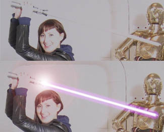
To really get to grips with Photoshop, Silicon Beach Training offer Photoshop Training and Advanced Photoshop Training , as well as InDesign Training in Brighton, Sussex. And for all those programming geeks reading this – did you know that we also now offer JavaScript Training, jQuery Training and Ajax Training too?!
So – here’s how to add a Photoshop lightsaber effect…
How to Create a Lightsaber Effect in Photoshop CS5
Here’s the original image – as you can see Jen’s got her lightsaber, but it’s just a white stick, which looks rubbish.
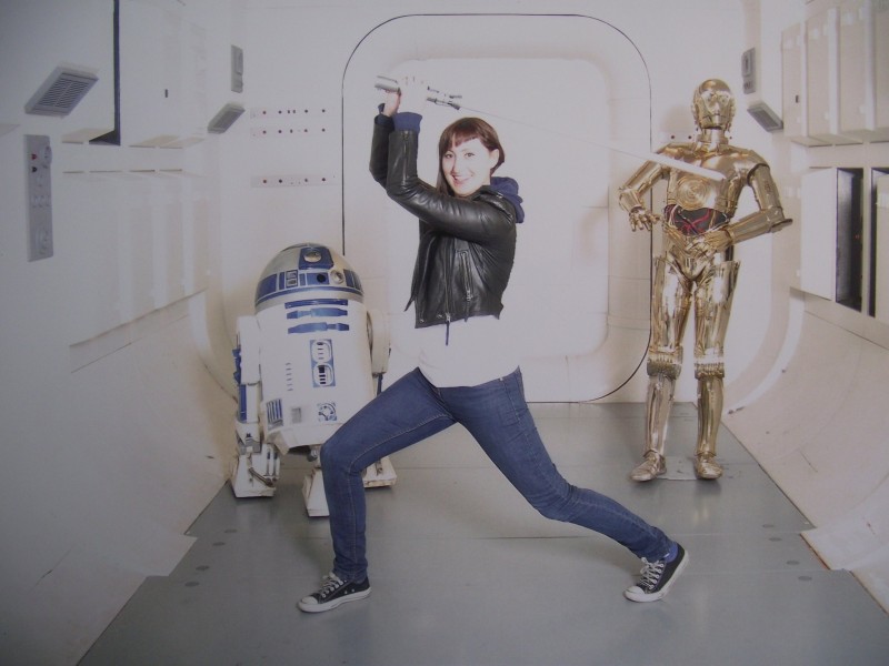
If you want to use this image for the Photoshop tutorial you can download it here – but much better to use your own. If you don’t have a toy light saber it doesn't matter – just strike the pose with something that looks like a light saber handle, and Photoshop can do the rest!!
Aaron Charlie
23 Feb 2011
Photoshop Lightsaber Tutorial
Find out how to create your own Photoshop lightsaber with this easy step-by-step tutorial!
Last weekend my good friend (and self-confessed Sci-Fi fan) Jen went to the London Film Museum, and had this great photo taken of herself brandishing a lightsaber in front of a piece of original Star Wars set. However the image was lacking a little something, which reminded me of a great trick in Photoshop to add a lightsaber effect.

To really get to grips with Photoshop, Silicon Beach Training offer Photoshop Training and Advanced Photoshop Training , as well as InDesign Training in Brighton, Sussex. And for all those programming geeks reading this – did you know that we also now offer JavaScript Training, jQuery Training and Ajax Training too?!
So – here’s how to add a Photoshop lightsaber effect…
How to Create a Lightsaber Effect in Photoshop CS5
Here’s the original image – as you can see Jen’s got her lightsaber, but it’s just a white stick, which looks rubbish.

If you want to use this image for the Photoshop tutorial you can download it here – but much better to use your own. If you don’t have a toy light saber it doesn't matter – just strike the pose with something that looks like a light saber handle, and Photoshop can do the rest!!
Aaron Charlie
23 Feb 2011
Check out our updated post with cover photo templates and dimensions for all the major social networks.
Facebook Timeline has arrived. First announced in October 2011, Facebook Timeline's official release has been put back, and back, and back again. You've always been able to install it using a Developer preview but at the end of January Timeline went live to the world. Now, it is about to become mandatory.
However, the first thing you will want to do is to customise your Facebook Timeline cover photo! Something you've never been able to do before!
It is a given that by the end of the year, business pages will also have Timelines. This will be a fantastic tool for marketers to make their Facebook page stand out from the rest so use our guide so that you already know what to do when business Timeline is released! For a full course on social media marketing you should come on Social Media Training. We offer some fantastic deals when booked with SEO Training and Content Marketing Training!
As our Google+ profile design template proved so popular we have been kind enough to do the same for Facebook Timeline.
![]()
Download the Facebook Timeline Cover Photo Photoshop Template.
You can get really creative with the new cover photo so we have included some of our favourite designs so far at the bottom of this post.
Leave a link to your profile once you've customised it in the comments section below and we will publish our favourites over the next few weeks.
If you haven't already then make sure you have added us on Facebook for all the latest news, offers and resources:
How to Customise Your Facebook Timeline
We have included a full step by step guide to using the Timeline Photoshop Template in our Complete Timeline Guide. The guide is also useful for changing your privacy settings and delving into all the new features before making your Timeline public.
Craig Charley
13 Feb 2012