What Is Negative SEO?
In simple terms, negative SEO is any act performed to harm a competitor. In this case I'm going to look at links as that's the biggest talking point and easiest to spot, but if you want to scare yourself then I recommend reading Kristine Schachinger's hair raising post on Extreme Negative SEO.
The act of building bulk backlinks to your site with exact match anchor text used to be a great idea. It resulted in higher ranking and was relatively easy to do. However, since the search engines have started cracking down on this hard, it's become a very bad thing for your site - just the sort of thing that can get your site penalised or even delisted by Google.
This is a move that promotes quality - that's great! But what if you're not the one building links to your site? What if a rival decides to turn their mass link building schemes on your site instead of theirs?
Craig Charley
15 Aug 2012
Is this the end of click-bait? Facebook has announced changes to the News Feed that should reduce the amount of click-bait headlines and improve user experience. What effect does this have on Facebook page owners?

Firstly, here's how Facebook is going to decide which posts are click-bait:
- Short clicks - a user clicks on a link and then quickly clicks back to Facebook. This indicates that the content did not match the headline. In reverse, the longer someone spends on a link, the more useful it will look to Facebook.
- Engagement - links that receive a lot of clicks but very few shares and likes will also be flagged as click-bait as it shows that the link was not valuable enough to earn a recommendation.
Aaron Charlie
27 Aug 2014
Is this the end of click-bait? Facebook has announced changes to the News Feed that should reduce the amount of click-bait headlines and improve user experience. What effect does this have on Facebook page owners?

Firstly, here's how Facebook is going to decide which posts are click-bait:
- Short clicks - a user clicks on a link and then quickly clicks back to Facebook. This indicates that the content did not match the headline. In reverse, the longer someone spends on a link, the more useful it will look to Facebook.
- Engagement - links that receive a lot of clicks but very few shares and likes will also be flagged as click-bait as it shows that the link was not valuable enough to earn a recommendation.
Aaron Charlie
27 Aug 2014
Twitter cards are an easy and effective way to make your tweets stand out in your followers' feeds.
Don't be limited by 140 characters, add enhanced links, product descriptions, media and more - all without affecting that character count!
You can start using Twitter cards by adding a few lines of HTML to your pages which will then generate the card when someone tweets that link - this is a quick setup that should have a huge impact on your visibility on Twitter and help drive engagement.
They also have the added bonus of unlocking Twitter Analytics (Twitter advertisers will already have access).
Twitter Card Types
- Summary Card: A card for links including title, description, thumbnail image and author/publisher @ handle
- Summary Card with Large Image: Same as summary card but with larger image and small description
- Photo Card: Card with one photo
- Gallery Card: Collection of up to 4 photos
- App Card: Highlights a mobile app with a download link
- Player Card: A card that allows embedded audio & video
- Product Card: Details product information
Each card type requires a different set of meta tags which will you will need to add to your page. Once you've added the tags, you need to validate the page before Twitter approves your cards and they start showing in Tweets.
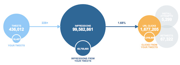
As mentioned, Twitter cards give you access to analytics to check the performance of your Tweets. It's a great way to monitor the effectiveness of different types of card and establish your top influencers.
Not getting the results you desire? Find out where you're going wrong with our 2 day Social Media workshops and learn how to start growing your network.
Craig Charley
25 Jul 2014
Twitter cards are an easy and effective way to make your tweets stand out in your followers' feeds.
Don't be limited by 140 characters, add enhanced links, product descriptions, media and more - all without affecting that character count!
You can start using Twitter cards by adding a few lines of HTML to your pages which will then generate the card when someone tweets that link - this is a quick setup that should have a huge impact on your visibility on Twitter and help drive engagement.
They also have the added bonus of unlocking Twitter Analytics (Twitter advertisers will already have access).
Twitter Card Types
- Summary Card: A card for links including title, description, thumbnail image and author/publisher @ handle
- Summary Card with Large Image: Same as summary card but with larger image and small description
- Photo Card: Card with one photo
- Gallery Card: Collection of up to 4 photos
- App Card: Highlights a mobile app with a download link
- Player Card: A card that allows embedded audio & video
- Product Card: Details product information
Each card type requires a different set of meta tags which will you will need to add to your page. Once you've added the tags, you need to validate the page before Twitter approves your cards and they start showing in Tweets.
As mentioned, Twitter cards give you access to analytics to check the performance of your Tweets. It's a great way to monitor the effectiveness of different types of card and establish your top influencers.

Not getting the results you desire? Find out where you're going wrong with our 2 day Social Media workshops and learn how to start growing your network.
Craig Charley
25 Jul 2014
Responsive web design is vital for making sure your visitors get as great an experience on their mobile as their desktop while browsing your site.
Our tutorials often aim at the beginner end of the scale, but this week we're going for something a bit more advanced. In this tutorial our HTML5 & CSS3 trainer Giselle explains how to convert navigation to a dropdown menu for smaller screens using CSS3 media queries.
This is one of the topics covered on our Mobile Web Design Week which combines our HTML5 & CSS3 Course with JavaScript training to give you a tool kit for designing mobile sites and also teaches you a best practice approach for responsive web design.

This tutorial assumes a familiarity with responsive web design and using CSS3 media queries to create different sets of styles for mobile devices. Click the links to find out more.
You do not have to test this in a mobile device. To test in your browser, simply resize your screen to the required width.
Why Convert to a Dropdown Menu?
If you have more than three buttons in your main navigation your menu will wrap or overlap when you decrease the width of your web page to fit it to a smaller mobile device screen. A popular method to get around this is to convert your menu to a dropdown. Other alternatives are to use display: block, or to use JavaScript or JQuery to toggle a menu when an icon or button is clicked on. Using display: block is a simple and quick way to style navigation for mobile dropdowns but won't work for menus with many links in them. Using JQuery to toggle the menu requires some knowledge of JQuery and JavaScript. Which method you use will depend on the particular site you are working on. This tutorial shows you how to use the first method and is quick and simple to implement.
Giselle
5 Oct 2012
On Sunday 14th October, Felix Baumgartner jumped out of a balloon 24 miles above the planet, breaking the speed of sound and a few world records to boot. It was an impressive feat, pushing the human body to new limits and showing what people are capable of achieving.
Watch the jump!
Not loading? Click here to watch on YouTube.
Red Bull Stratos was a collaborative event, with the previous record holder for sky diving - 84 year old Joe Kittinger - guiding Felix from the ground, a whole team supporting and organising the jump, and just a bit of help from the sponsor Red Bull. It was also what I believe to be the first truly global social media event. Read on to find out what I mean by that...

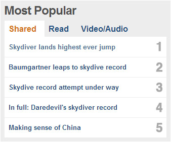
If you want to find out more about the jump itself, head to the Red Bull Stratos website or the BBC where it's proving quite a popular subject today, claiming 4 out the top 5 most shared stories:
Want to publicise events like Red Bull? We offer tailored social media training packages. Combine our social media, content marketing and WordPress courses to learn how to build a website and create and marketing content using social media.
Craig Charley
15 Oct 2012
On Sunday 14th October, Felix Baumgartner jumped out of a balloon 24 miles above the planet, breaking the speed of sound and a few world records to boot. It was an impressive feat, pushing the human body to new limits and showing what people are capable of achieving.
Watch the jump!
Not loading? Click here to watch on YouTube.
Red Bull Stratos was a collaborative event, with the previous record holder for sky diving - 84 year old Joe Kittinger - guiding Felix from the ground, a whole team supporting and organising the jump, and just a bit of help from the sponsor Red Bull. It was also what I believe to be the first truly global social media event. Read on to find out what I mean by that...

If you want to find out more about the jump itself, head to the Red Bull Stratos website or the BBC where it's proving quite a popular subject today, claiming 4 out the top 5 most shared stories:

Want to publicise events like Red Bull? We offer tailored social media training packages. Combine our social media, content marketing and WordPress courses to learn how to build a website and create and marketing content using social media.
Craig Charley
15 Oct 2012