Excel's Auto Sum feature is a handy time-saving feature that prevents you having to type out lists of commonly used values like sequences of numbers, days of the week or months. Auto Sum is covered in our Excel Beginners Training Course.
Written Instructions
Let's demonstrate this with months. Type "January" in to a cell in your spreadsheet. Highlight the cell and you'll see that there's a little black arrow in the bottom right hand corner. Carefully click on this arrow with the mouse (a bit fiddly!) and hold the button. Now drag the box downwards a few cells and release, and Excel will fill in the subsequent months for you. Clever eh! Even better, it will also recognise abbreviations, such as Jan, Feb, Mar etc...

When you have finished dragging you will also see an Auto Fill options box appear.
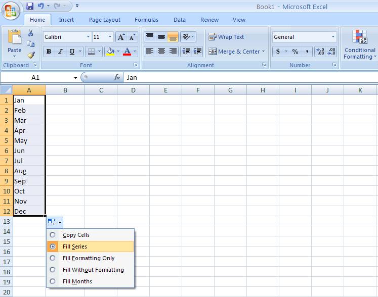
If you click on this a drop down menu will appear showing you a list of further options. Whatever you press in this drop down menu will affect the series of numbers that you have created. If you would rather not have Excel type out all of the months and want all of the cells to say January, use the “copy cells” option
Andy Trainer
6 May 2009
Excel's Auto Sum feature is a handy time-saving feature that prevents you having to type out lists of commonly used values like sequences of numbers, days of the week or months. Auto Sum is covered in our Excel Beginners Training Course.
Written Instructions
Let's demonstrate this with months. Type "January" in to a cell in your spreadsheet. Highlight the cell and you'll see that there's a little black arrow in the bottom right hand corner. Carefully click on this arrow with the mouse (a bit fiddly!) and hold the button. Now drag the box downwards a few cells and release, and Excel will fill in the subsequent months for you. Clever eh! Even better, it will also recognise abbreviations, such as Jan, Feb, Mar etc...

When you have finished dragging you will also see an Auto Fill options box appear.

If you click on this a drop down menu will appear showing you a list of further options. Whatever you press in this drop down menu will affect the series of numbers that you have created. If you would rather not have Excel type out all of the months and want all of the cells to say January, use the “copy cells” option
Andy Trainer
6 May 2009
|
So it's finally here! Apple CEO Tim Cook announced iOS 7 yesterday, hailing it as the "biggest change to iOS since the introduction of the iPhone". It's been long-awaited and much debated but now we can finally see what all the fuss is about. It's not going to be out for a while yet though, so now's the perfect time to learn how to create apps, on our iOS App Development Course. Now there a plenty of articles out there which go into great detail about the move away from skeuomorphism and others which wax lyrical over the new Control Center. We won't do that. |

We're going to give you the facts (7 of them to be precise) and a quick summary of the key points you need to know about each one. Just enough knowledge to rattle out to your friends over a skinny chai latte at your local vegan coffee shop (or some other lazily stereotypical hipster activity).
So let's dive into this new apple-y world full of flat buttons, Instagram-esque camera filters and mesmerising translucent displays and see what we can find.
1/ iOS 7 New Design
This is what all the hype is mostly about, and not without reason. The entire look and feel of the system has changed dramatically - modernised even. Take a look at this comparison between the design of the iOS6 and 7 home screen:
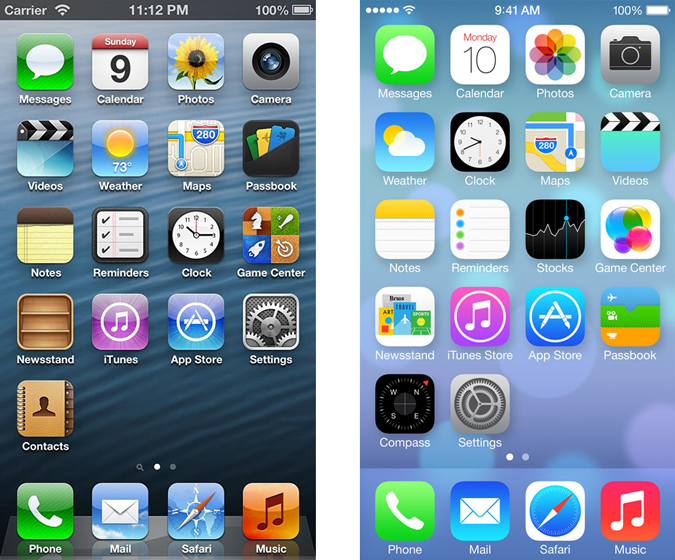
Gone are the shadows, the bevels and the semi-bold font. In come bright colours, flat-looking buttons and a thin, stylish type-face.
Aaron Charlie
12 Jun 2013
Responsive Web Design is happening right now, it has hit the mainstream and will be around for quite a while. Once you've been on our Responsive Web Design course, there are a huge number of online tools to help you switch to a responsive design workflow and develop your skills and your sites even further. In this post, we're going to run through some of the best.

Responsive Design Workflow: You’re Going to Need a lot, Less Paper!
Workflows are changing with responsive design: there’s less reliance on mock-ups and more emphasis on HTML and CSS prototypes. Although these take longer initially, iterations in response to client feedback are much quicker as they can be done live. Responsive design heavily supports CSS instead of graphics wherever possible, meaning that the majority of tweaks will be made in the style sheet.
Read the case studies below to see what’s involved:
Luke Wroblewski - An Event Apart: The Responsive Designer’s Workflow
MEric Bidelman - Mobifying Your HTML5 Site
Wireframing Templates
Wireframes now need to include a range of devices, as well as consider how easy it is for the user to tap on areas of the screen. These free templates enable you to sketch your design on actual size, pre-created templates for seven mobile platforms.
Giselle
22 Nov 2012
When you come to us for training in PRINCE2, or to learn how to use Microsoft Project, we'll teach you about using Gantt charts to plan and track the progress of your project.
But what do we know about where they came from? Here’s a little bit about Henry Gantt, the brains behind the Gantt Chart.
Henry Laurence Gantt
Henry Gantt was born in 1861 in Maryland, USA. He died in 1919 and developed the management tool that is the Gantt chart just after the turn of the century. He was educated at the Stevens Institute of Technology and became a mechanical engineer.
Gantt soon became known for his passion for economy/efficiency and for his sense of social responsibility. He was an advocate for the social responsibility of businesses and of applying scientific analysis to improve efficiency in industry. While he was a technician, he always strove to develop the most economical methods of production, and achieved a job role of “efficiency expert” at a textile plant in 1904.

Andy Trainer
16 Aug 2012
For those of you that know Brighton, you can be a testament to the fact that it is filled with a myriad of great places to eat and drink for every kind of consumer. When you’re here for just a short time knowing where to go on your lunch break is of great importance to most!
Don’t stick to the boring sandwich but taste a bit of Brighton without breaking the bank, here are a few of our favorites...... our 7 lunch wonders of Brighton!
Our key to pricing:
£ - under a fiver
££ - between £5 and £10

Pastrami Sandwich from Flour Pot, Image courtesy of Restaurants Brighton
Sarah Longbottom
17 Jun 2016
It is very easy to open up your website on a smartphone or tablet and make the snap judgement that because it loads and the links work you can leave it as it is. However, how many businesses go the next step and think about how usable their site is on mobile devices? Or how attractive it is?
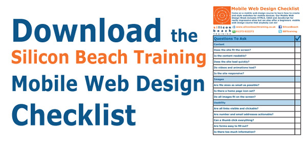
In this blog post, we have produced a checklist to help businesses perform a mobile site audit to ensure their site is as mobile-friendly as possible. Click the image to download theSilicon Beach Training Mobile Web Design Checklistand then read through this blog to find out why each point is so important.
Come on one of our Mobile Development Courses to learn how to create mobile websites and apps from scratch from our industry expert trainers. We run a beginners Mobile Web Design course which is suitable for all skill ranges and aMobile Web Design Week workshopwhich is more advanced, containingHTML5, CSS3andJavaScripttraining alongside an overview ofmobile web best practice. For the more experienced programmers, we also provideiPhone App Development trainingandAndroid App Development Training. Read on to find out why mobile should be a top priority for business in 2012...
Why Go Mobile?
 Regular visitors to the site will know how strongly we believe that the future of technology lies with mobile. Our recent mobile post highlighted howApple sold more iPhones and iPads in 2011 than they sold computers in 11 years. That is a staggering stat. Another recent figure claims that1.45 million mobile devices enter the world every day compared to 317,124 births.
For whatever reason, mobile devices have achieved something that desktops and laptops never truly managed - they have become a consumer device. Nobody sees a desktop sitting at home, but people go out of their way to flaunt the latest smartphone and read the news on their iPad on the way to work. They have become a fashion accessory as much as a communication device.
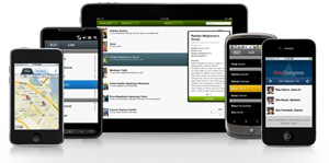
As a result of this, more and more people are accessing the internet on the go on smaller screens. Any business that has not considered a mobile strategy is potential missing out on interest and sales. Mobile use has been proven to have a higher click through rates and higher average spend. So not only are some businesses missing out on potential customers but those customers are likely to spend more money!
Silicon Beach Training Mobile Web Design Checklist
This downloadableMobile Web Design Checklistis not a definitive guide to styling websites for mobile devices but it is a useful list of features to consider to ensure a website works properly on a mobile device.
Craig Charley
2 Mar 2012
It is very easy to open up your website on a smartphone or tablet and make the snap judgement that because it loads and the links work you can leave it as it is. However, how many businesses go the next step and think about how usable their site is on mobile devices? Or how attractive it is?
In this blog post, we have produced a checklist to help businesses perform a mobile site audit to ensure their site is as mobile-friendly as possible. Click the image to download theSilicon Beach Training Mobile Web Design Checklistand then read through this blog to find out why each point is so important.
Come on one of our Mobile Development Courses to learn how to create mobile websites and apps from scratch from our industry expert trainers. We run a beginners Mobile Web Design course which is suitable for all skill ranges and aMobile Web Design Week workshopwhich is more advanced, containingHTML5, CSS3andJavaScripttraining alongside an overview ofmobile web best practice. For the more experienced programmers, we also provideiPhone App Development trainingandAndroid App Development Training. Read on to find out why mobile should be a top priority for business in 2012...
Why Go Mobile?
 Regular visitors to the site will know how strongly we believe that the future of technology lies with mobile. Our recent mobile post highlighted howApple sold more iPhones and iPads in 2011 than they sold computers in 11 years. That is a staggering stat. Another recent figure claims that1.45 million mobile devices enter the world every day compared to 317,124 births.
For whatever reason, mobile devices have achieved something that desktops and laptops never truly managed - they have become a consumer device. Nobody sees a desktop sitting at home, but people go out of their way to flaunt the latest smartphone and read the news on their iPad on the way to work. They have become a fashion accessory as much as a communication device.
As a result of this, more and more people are accessing the internet on the go on smaller screens. Any business that has not considered a mobile strategy is potential missing out on interest and sales. Mobile use has been proven to have a higher click through rates and higher average spend. So not only are some businesses missing out on potential customers but those customers are likely to spend more money!
Silicon Beach Training Mobile Web Design Checklist
This downloadableMobile Web Design Checklistis not a definitive guide to styling websites for mobile devices but it is a useful list of features to consider to ensure a website works properly on a mobile device.
Craig Charley
2 Mar 2012
